After a year of research and design work in collaboration with brand experts and graphic designers from STOKE Strategy and Turnstyle, and with key stakeholders, we are excited to share Fulcrum Foundation’s new visual identity with you, our closest friends and supporters.
The motivation for this initiative came from a desire to find ways to further inspire those closest to our mission as well as to engage many more who do not yet know of Fulcrum’s impactful work. Importantly, while the look and feel of Fulcrum’s brand is changing, our commitment to leveraging support for Catholic schools is as steady and as strong as it has ever been. In fact, this change to our brand exemplifies our commitment to continually seek new, innovative, and highly strategic responses to the challenges of our day so that we might better strengthen and support Catholic schools and the children and families they serve so very well.
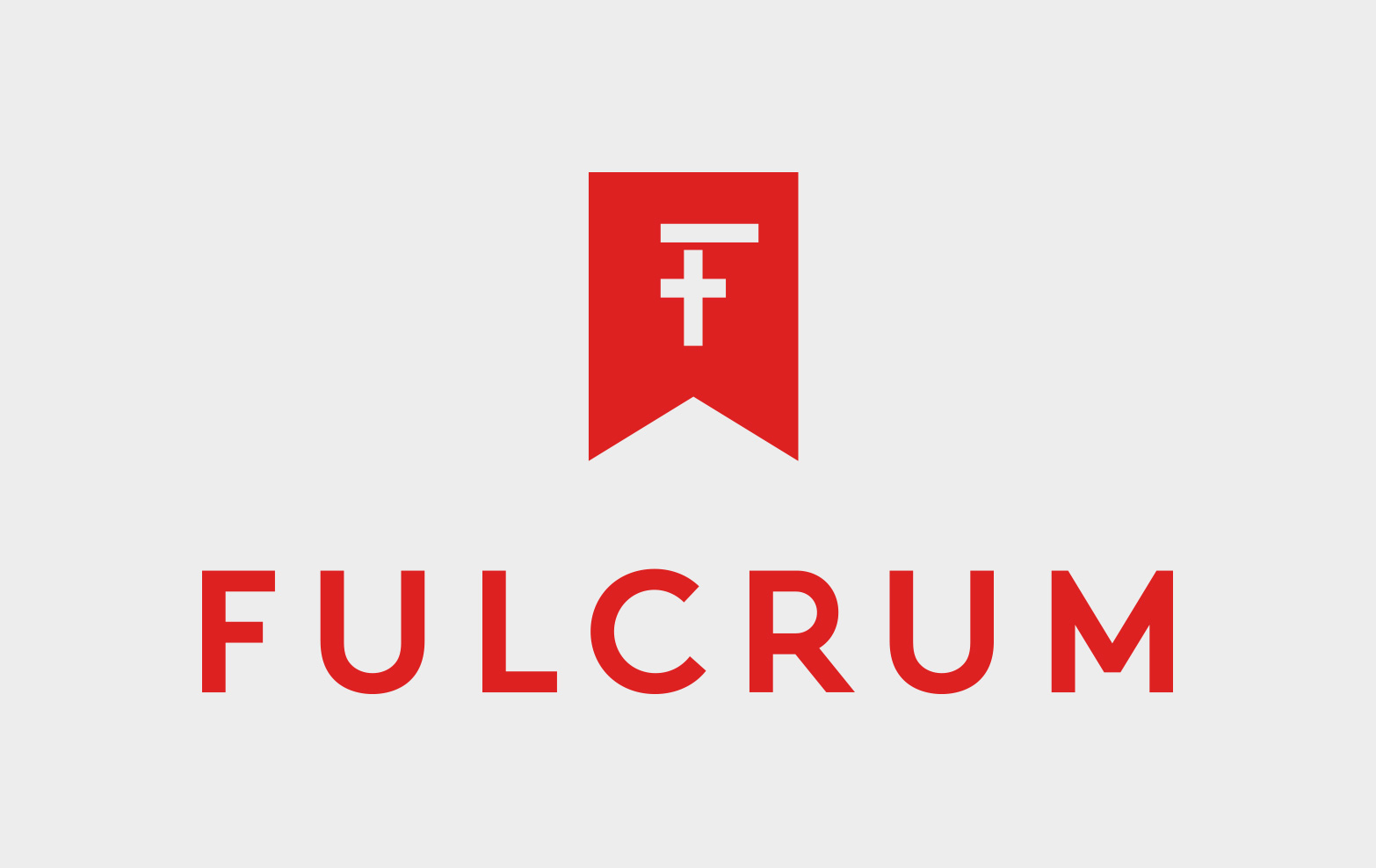
Fulcrum’s new visual identity marries a sharp, clever, and modern theme with classic images that together illuminate the heart and soul of our work and mission. Take the logo for example: the vibrant red is the color for feast days and of celebrations, providing the backdrop for a cross that also forms an “F” for Fulcrum. And the new lettering is important, too: strong, bold and vertical lines symbolize strength and stability that are hallmarks of the Fulcrum Foundation, and are key properties of a fulcrum that provides the stable base and pivot point for any lever. The new logo and lettering of the Fulcrum brand were designed with these themes in mind.
Starting this month— and with this edition of Fulcrum News—our new logo, lettering, and color scheme will be incorporated into all Fulcrum communications and materials. Be sure to explore our website in the coming weeks to see the new Fulcrum brand come to life digitally, and to see and read about all the new ways we are leveraging support for Catholic schools.